THE ORIGIN OF A LEGEND
Maradona Academy
Services
- BRANDING
- SHOOTING
- DIGITAL MARKETING
Abstract
The challenge
To create a visual identity for Maradona Academy that would reflect the greatness of its inspiration, Diego Maradona, and that would stand out as an innovative and professional academy, capable of combining tradition, prestige and modernity.
The Visual Identity System
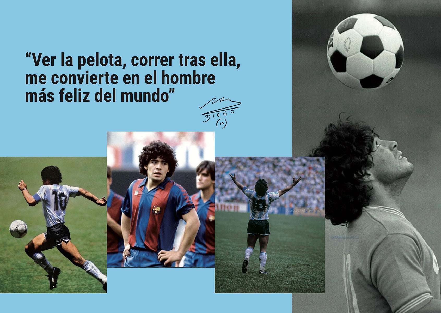
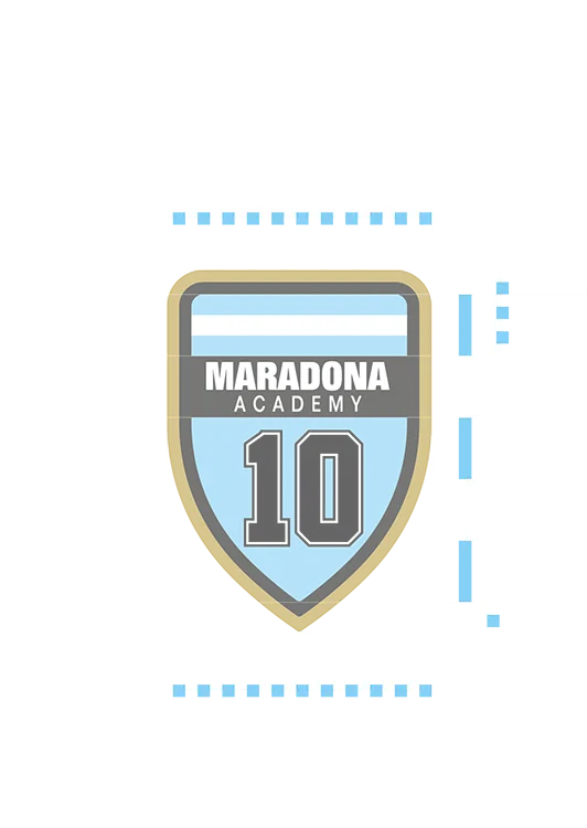
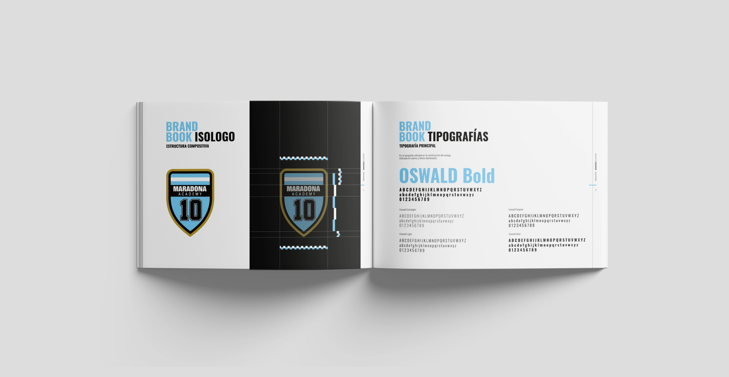
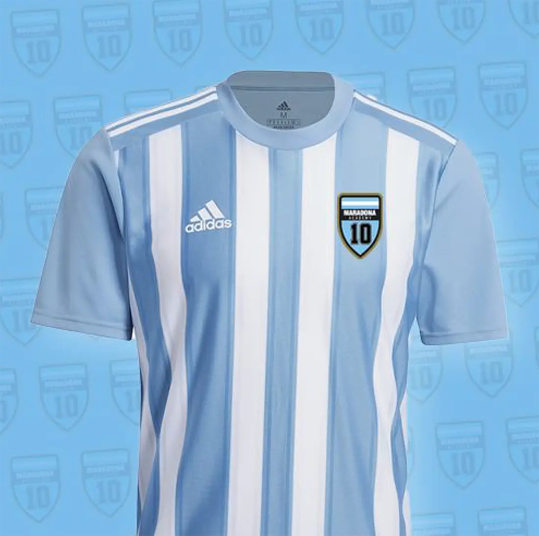
The logo, designed as a shield, becomes a central emblem that not only represents the brand but is also used on student uniforms, reinforcing a sense of belonging. The colors of the Argentine national team and the iconic number ten, a symbol of Maradona’s legend, are integrated to convey the spirit of football and the passion for the sport.
The gold tone adds a touch of prestige and excellence, while the bold, modern typography reflects clarity and confidence. The flowing line, inspired by pitch markings, brings dynamism to the visual system, highlighting key information and giving the brand a strong and energetic personality.
Promotional Materials and Visual Strategy
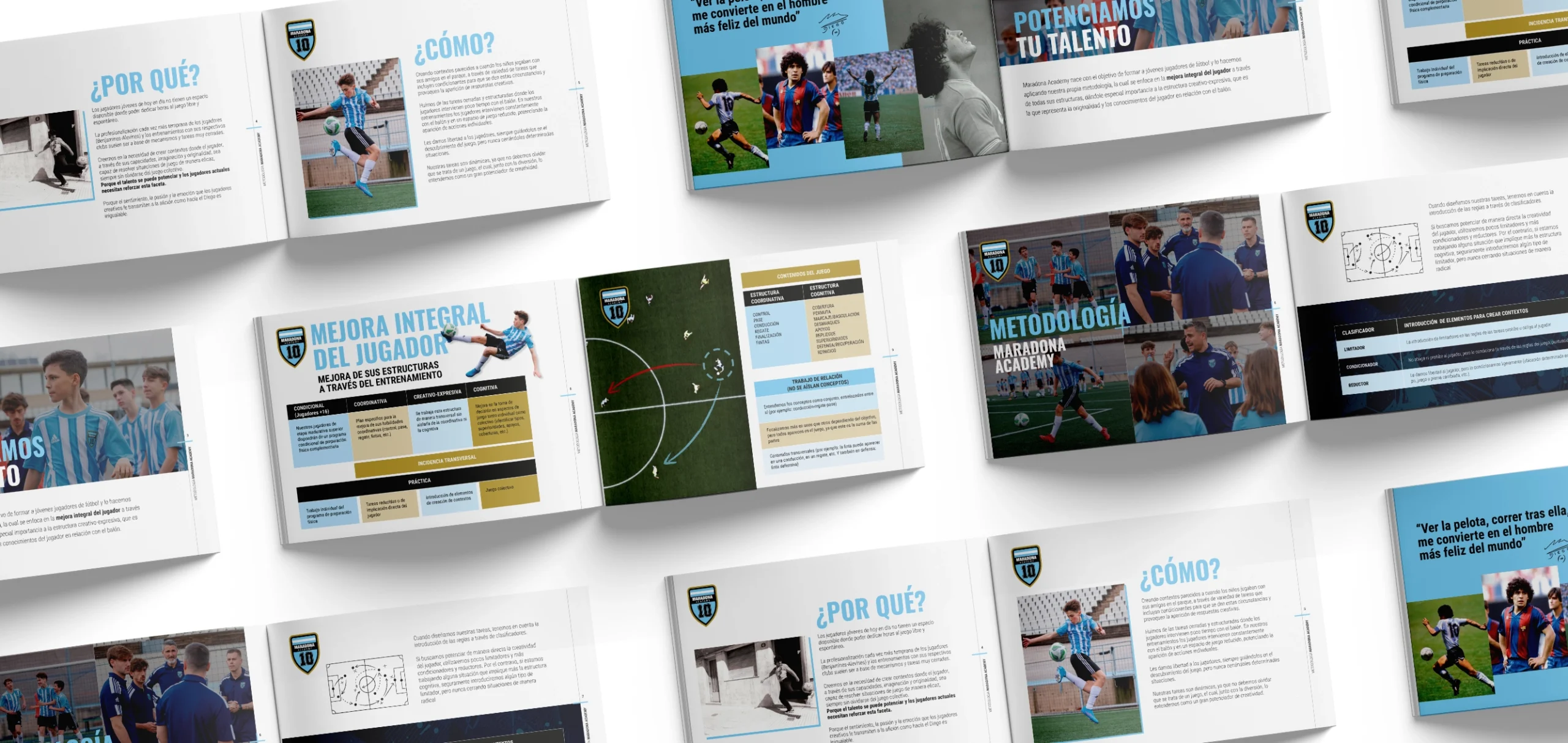
The visual system designed for Maradona Academy is reflected in all promotional materials, from catalogs and flyers to its website, creating a consistent and recognizable graphic identity. The dynamic line used in the designs connects all the elements, reinforcing cohesion and projecting a professional and sporty brand image.
The photoshoot and branded video report, along with the animated elements, convey a sense of freshness and professionalism, highlighting the technological innovations the academy employs to enhance each student’s skills. These tools not only showcase the academy’s technical and creative approach but also communicate its commitment to the comprehensive training of future talent.
Maradona Academy demonstrates how the power of a symbol and a dynamic visual system can transform a brand’s communication into a unique and inspiring experience.
FAQs
Branding in the sports environment goes beyond the visual: it builds attitude, belonging and aspiration. Through symbols, language and narrative, a universe is created that emotionally connects with the community.
Design turns the values of sport —energy, dynamism, self-improvement— into a structured graphic language. Typography, colour and composition work together to project a solid and recognisable identity.
Creative direction defines the concept that gives meaning to the entire brand. It allows aligning aesthetics and strategy to build a solid, distinctive narrative capable of connecting with demanding audiences.
Visual content translates the brand’s values into dynamic experiences. Through image, video and graphic resources, it generates impact, conveys authenticity and strengthens the bond with the community.
Digital marketing amplifies the brand’s presence and connects it with its audience in real time. A well-defined strategy allows generating awareness, loyalty and an active community around the project.