FRESHNESS MADE DESIGN
Mikso
Services
- PACKAGING
- DESIGN
Abstract
MIKSO is a food brand that produces 100% natural vegetable chips, without additives and using locally sourced ingredients. Its proposal connects with the growing trend towards healthy snacking, combining flavor, freshness, and Mediterranean authenticity. At MC Advertising, we worked on the design of its packaging range, creating a visual identity that reflects naturalness and positions the product within the healthy snacks segment.
The challenge
To design packaging capable of conveying the natural essence of the products while also standing out in a saturated healthy snack market. The project needed to find the balance between freshness, authenticity, and commercial appeal, with a concept designed to reinforce the brand identity and ensure clear differentiation on the shelf.
A fresh and natural visual language
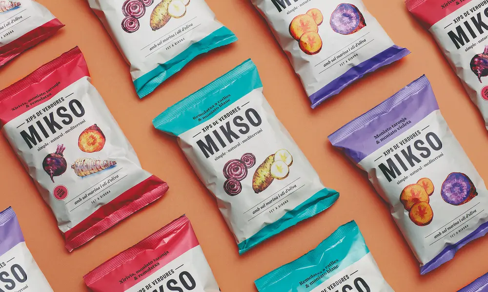
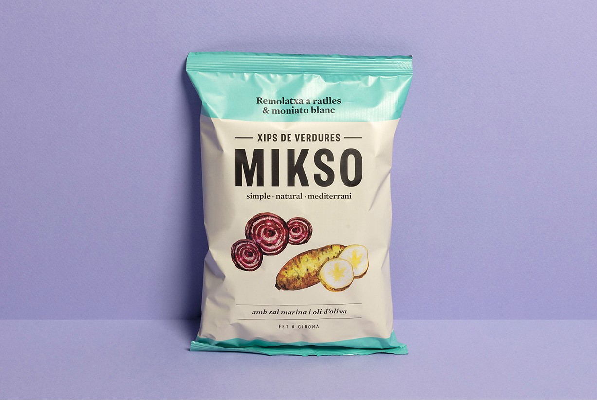
MIKSO’s packaging was born from a simple idea: letting its vegetable chips speak for themselves. Realistic, hand-drawn illustrations convey authenticity and proximity, placing the ingredients at the forefront.
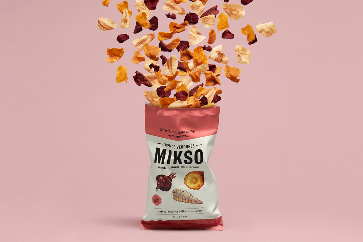
We designed a visual system that integrates color, typography, and composition into a single logic. Vibrant colors at the top of each pack add energy, facilitate shelf differentiation, and allow each flavor to be instantly recognized. The clear and bold typography ensures legibility and builds trust, while the use of open spaces and a clean structure reinforces the feeling of freshness and gives prominence to the product and its essential message.
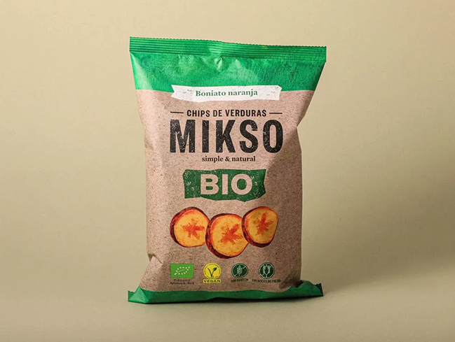
A BIO range with its own identity
For the BIO line, we developed a specific graphic language: kraft material and a deep green that evoke sustainability and closeness to the earth. A proposal we translated into the packaging to reinforce the brand’s commitment to conscious consumption, integrating each pack into a narrative where naturalness and responsibility coexist.
A piece of applied visual communication that turns every bag into an ambassador of MIKSO’s freshness and Mediterranean character.
FAQs
Packaging is the first point of contact between product and consumer. A well-designed pack conveys quality, helps differentiation on the shelf, and communicates brand values instantly.
Through the use of color, composition, and visual hierarchy, design helps the product stand out from competitors and makes it easily identifiable to consumers.
Graphic design translates brand values into a visual language. It helps build a consistent and recognizable identity across all touchpoints.
A well-defined visual identity ensures consistency across all touchpoints. This strengthens brand recognition and builds consumer trust.
Design shapes how a product is perceived before it is experienced. Through visual elements, it can communicate attributes such as quality, naturalness, or innovation.