ESSENTIAL MADE VISIBLE
Bivena
Services
- PACKAGING
- DESIGN
- BRANDING
Abstract
Bivena embraces the pleasure of natural food in everyday life: granolas made with selected ingredients and responsible processes, designed for a conscious consumer. At MC Advertising, we shaped its universe through logo design, packaging design, brand identity definition and the initial social media set up. A coherent system that reinforces its positioning and projects authentic nutrition with character.
The challenge
To provide Bivena with a solid and distinctive identity in a market where the healthy offer is constantly growing. The brand had to convey freshness, lightness and naturalness, while also projecting its own character, capable of connecting in the digital environment and standing out on the shelf. The key: a coherent visual language under a single brand narrative.
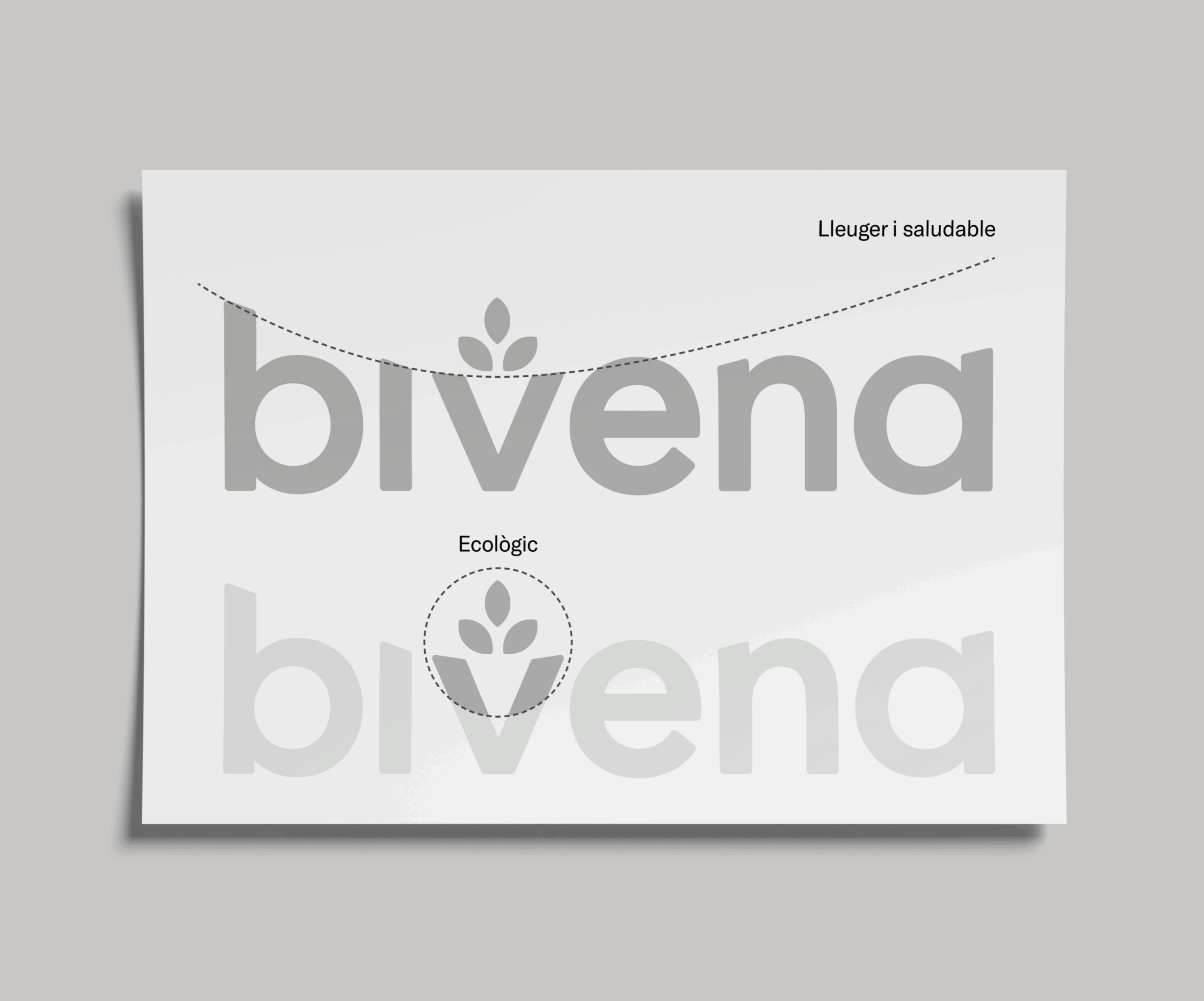
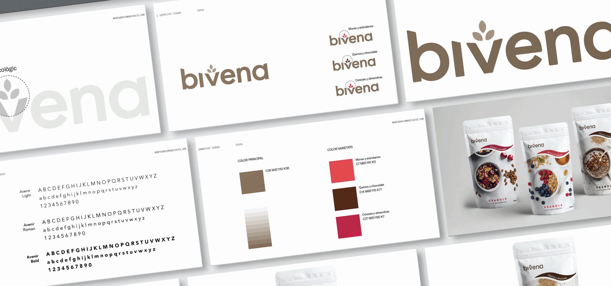
A fresh and conscious identity
The Bivena logo was conceived as a light and healthy sign, with curves that express proximity and naturalness. The central graphic element —an organic shape that evokes the seed and the sprout— acts as a metaphor for the ecological, reinforcing the connection with the earth and the natural origin of the product. This visual construction provides coherence and symbolism, consolidating a close and recognizable identity.
The social media set up was conceived as the brand’s first extension into the digital environment. The visual approach balances freshness, clarity and vitality, creating a harmonious mosaic in line with the brand identity.
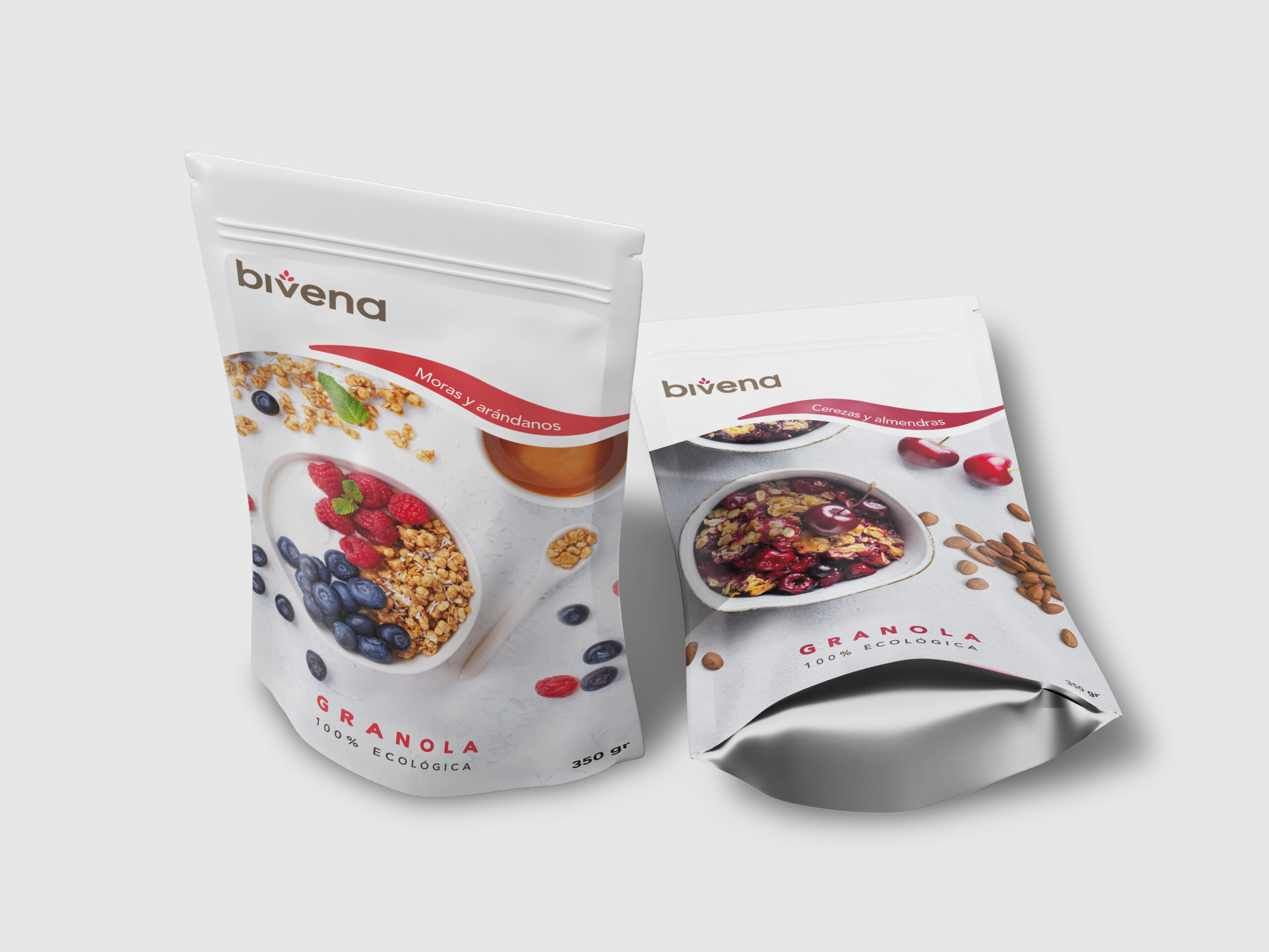
Packaging with its own flavour
More than just a container, Bivena’s packaging was designed as a sensorial window into the product. Photography takes centre stage, evoking texture, aroma and flavour as a first invitation to the consumer. Each variety is distinguished by a specific colour code, creating an orderly and recognizable visual system. The result is an attractive and honest design, able to stand out on the shelf and project trust through its transparency and graphic coherence.

An integral design project that turns naturalness into identity and honesty into visual language. Bivena shows how the essential can be expressed with clarity and coherence, building a brand that inspires trust, vitality and closeness.
FAQs
In a market where many proposals share similar values, branding allows building a differentiated identity. It defines how the brand is perceived and conveys trust, quality and authenticity from the first contact.
Packaging is the first point of contact with the consumer. A well-designed approach not only attracts visually, but also communicates values, facilitates product identification and reinforces the perception of quality on the shelf.
From a graphic system that integrates logo, typography, color and visual resources. This coherence allows the brand to be recognizable across any medium and conveys solidity and professionalism.
The set up defines the visual and strategic foundations of the digital profile: from image to tone and creative direction. It is key to ensuring a coherent presence from the beginning and facilitating brand growth in the online environment.
Design translates strategy into a visual language. Through shapes, colors and composition, it allows communicating concepts such as naturalness, freshness or quality, aligning what the brand is with what the consumer perceives.