CONNECTED TO THE FUTURE
Guixés
Services
- BRANDING
- DESIGN
- SOCIAL MEDIA
- DIGITAL MARKETING
Abstract
Guixés positions itself as a strategic player in the energy and telecommunications sectors, standing out thanks to its genuine connection to the territory and its own energy production model. This unique approach not only strengthens its brand identity but also allows it to respond precisely to market needs. In a highly competitive environment, Guixés has leveraged key insights, turning its local proximity into a differential value driver for its services.

The challenge
To update the brand to reflect its values of proximity and transparency while reinforcing its market positioning.

A New Visual Identity
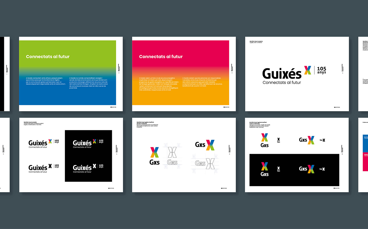
The Guixés rebranding modernized its logo while preserving its essence, highlighting the iconic “x” with greater personality and integrating an imagotype with a four‑color gradient symbolizing diversity and inclusion. The geometric, rounded, bold typography reinforces values of clarity, proximity, and accessibility, reflecting a friendly and personalized brand.

Communication Strategy
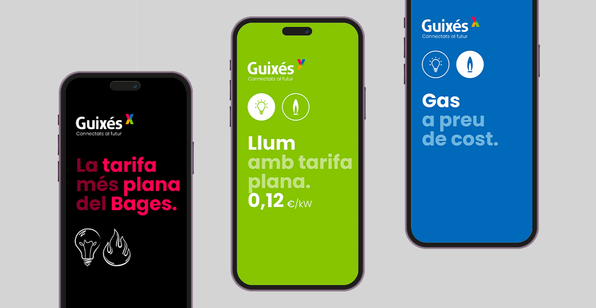
The promotional campaigns for Guixés were designed to communicate clear, effective messages that highlight its differential advantages. With a focus on clarity and visual recognition, we developed a coherent visual system to ensure consistency at every touchpoint.
From online to offline media, every ad piece is designed for multiple impacts, strengthening brand presence and making the message resonate deeply with the audience. This strategy enhances visibility and positions Guixés as a trusted, approachable choice in the energy and telecommunications sector.

The Guixés project is an example of how design and strategic communication can transform a visual identity to meet the needs of a competitive market without losing sight of the brand’s core values. A rebranding designed to connect, inspire trust, and position Guixés as a close and accessible leader in its sector.

